
Theme.json is the main configuration file in the WordPress full site editing block theme. It is written in JSON format. This file is placed inside the main (root) folder of the theme.
JavaScript Object Notation (JSON) is a text-based data format following JavaScript object syntax.
The theme.json file provides an easy option to define various theme supports and setting that we need to define in function.php earlier.
- You can enable and disable different features in theme.json without needing add_theme_support in function.php.
- You can enable and disable options for block editor.
- You can define default styles and settings like colors, font sizes, layout width, etc.
- You can define all these settings and styles globally or for an individual block.
- You can set different preset for users to select in the block editor.
- The specification defined in theme.json file overrides the WordPress core’s default. And, Users can override both core and theme style from site-editor (from WordPress Back-end).
Also: Find Top 10 Best WordPress Theme for 2022 including both Free & Paid themes.
Table of Contents
Theme.json Structure
Theme.json is a JSON file that begins with {left brace and ends with }right brace.
All content will be placed inside these brackets.
Then use a format with property key & values, and separated with a colon: .
All Property key is enclosed in ” ” double-quotes.
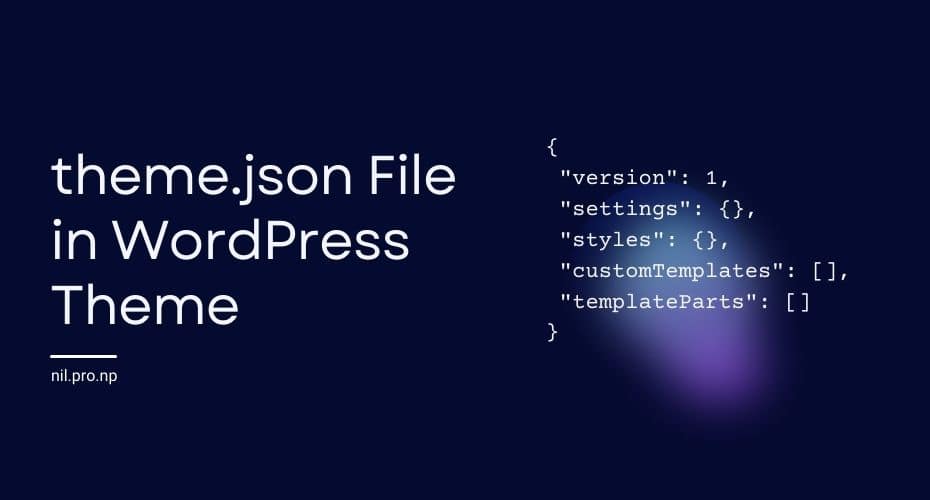
Theme.json file has main five properties:
- Version: Describes the format of theme.json.
- Settings: Here we enable or disable different features. And, set preset for color palette, gradient, duotone, fontSizes, fontFamilies.
- Styles: This block of code defines the default style for the theme.
- customTemplates: This block of code defines a custom template.
- templateParts: Here, we assign templates parts to template areas like header template to header area.
Each property block contains nested properties and they may be nested on several levels.
{ // JSON data begin.
    "version": 1, //Describes the format of theme.json
    "settings": {}, // Options to enable/disable different feature and defines preset.
    "styles": {}, // Defines default style.
    "customTemplates": [], // Registering Custom Templates
    "templateParts": [] // Asigning templates parts to template area
} // JSON data end.
Setting & Styles has two scopes: Global and Block level.
- Global Scope: All directly defined configuration blocks inside Settings & Styles sections are global. The Configurations declared at the top level affect all blocks unless a particular block overwrites it.
- Block Scope: Configurations nested inside “blocks” then “Block Name” are for that particular block.
We will discuss all main properties blocks and configurations related to each section in the next section.
Version
Version describes the format of theme.json. The current version is 1. WordPress 5.8 will ignore the contents of any theme.json whose version does not equal to the current version (1).
Setting
This section contains two types of configuration: Features configuration (Settings) and Preset. Configurations defined within the setting block have two scopes: Top-level (Global Scope) and Block-level.
Features Settings:
This block of configuration enables & disables the features in the block editor that we had to do with add_theme_supports in a classic theme.
Presets
It contains preset values of different options for a block editor like color palettes, font sizes, or gradients.
They are values that are shown to the user via some UI controls. Most of the preset value automatically generates corresponding CSS classes and custom properties (CSS variables).
color.duotone: doesn’t generate classes or custom properties.color.gradients: generates a single class and custom property per preset value.color.palette:- generates 3 classes per preset value: color, background-color, and border-color.
- generates a single custom property per preset value
typography.fontSizes: generates a single class and custom property per preset value.typography.fontFamilies: generates a single custom property per preset value.
The naming schema for the classes and the custom properties is as follows:
- Custom Properties (CSS Variables):
-wp--preset--{preset-category}--{preset-slug}such as-wp--preset--color--black - Classes:
.has-{preset-slug}-{preset-category}such as.has-black-color.
In addition to above mentioned presets we can define custom preset under the custom block section:
Custom
This is where we can define custom preset values. Any preset values declared within the custom section will be transformed to CSS Custom Properties (CSS Variables) following this naming schema: --wp--custom--<variable-name>.
Setting Section Configuration
{
    "version": 1,
    "settings": { //Setting Configuration
        "border": { // Enable/disables different options for borders feature
            "customColor": false, // Controls custom color selection option for border
            "customRadius": false,
            "customStyle": false,
            "customWidth": false
        },
        "color": { // Enable/disables different options related to color property
            "custom": true, // Controls options to choose custom color other than preset value define on palette section later
            "customDuotone": true,
            "customGradient": true,
            "duotone": [], //Defines duotone preset value
            "gradients": [],//Defines gradients preset value
            "link": false, // Options to select link text color
            "palette": [] // Defines color plates preset value
        },
        "custom": {}, // This section gives us option to define custom preset option
        "layout": { //replaces add_theme_support( 'align-wide' ); and defines the width of the content.
            "contentSize": "800px",//Default block width
            "wideSize": "1000px" //Width of blocks when the wide align selected
        },

        "spacing": { //controls support for custom padding and margin & custom units
            "customMargin": false,
            "customPadding": false,
            "units": [ "px", "em", "rem", "vh", "vw" ]
        },
        "typography": { //Controls options to set different feature of font
            "customFontSize": true, // Controls option to choose custom font size
            "customFontStyle": true, // Controls option to choose custom font style
            "customFontWeight": true,
            "customLineHeight": false,
            "customTextDecorations": true,
            "customTextTransforms": true,
            "dropCap": true,
            "fontFamilies": [], //Defines font family preset valuse
            "fontSizes": [] //Defines list of font size value (preset)
        },
        "blocks": { //All setting inside this part are responsible for particular block and
		//it overrides the global configuration for that block
            "core/paragraph": { // Setting of this part are responsible for paragraph block only in Gutenberg editor
                "border": {},
                "color": {},
                "custom": {},
                "layout": {},
                "spacing": {},
                "typography": {}
            },
            "core/heading": {}, //Similary this part of configuration overrides global setting for heading block
	    ...
        }
    } //Setting block closing
...
}
Styles:
This section defines the default theme style. These are the overall theme style that will be applied to the site without having to edit individual blocks or pages. In addition to here, we can also add an extra CSS file by enqueuing in in function.php.
The styles defined here has 3 types of scope:
Top Level (Global): Values defined directly inside the “styles” section will be enqueued using the body selector.
Block Level: Styles defined inside respective block names within “blocks” are applied to respective blocks only. By default, the block selector is generated based on its name such as .wp-block-<blockname-without-namespace>. For example, .wp-block-group for the core/group block. There are some blocks that want to opt-out of this default behavior. For example, p selector for core/paragraph block.
Element Style: In addition to top-level and block-level styles, there are certain element we can define separately. Element style can define in both top and block level.
link: maps to theaCSS selector.h1: maps to theh1CSS selector.h2: maps to theh2CSS selector.h3: maps to theh3CSS selector.h4: maps to theh4CSS selector.h5: maps to theh5CSS selector.h6: maps to theh6CSS selector.
{
    "version": 1,
    "settings": {...},
    "styles": { // Styles for theme is defined here
        "border": { //Default border style
            "color": "value",
            "radius": "value",
            "style": "value",
            "width": "value"
        },
        "color": { //Default color's applied when used
            "background": "value",
            "gradient": "value",
            "text": "value"
        },
        "spacing": {
            "blockGap": "value", //Default Gap between block
            "margin": { //Default Margin
                "top": "value",
                "right": "value",
                "bottom": "value",
                "left": "value"
            },
            "padding": { //Default padding
                "top": "value",
                "right": "value",
                "bottom": "value",
                "left": "value"
            }
        },
        "typography": {// Default font related style
            "fontFamily": "value",
            "fontSize": "value",
            "fontStyle": "value",
            "fontWeight": "value",
            "lineHeight": "value",
            "textDecoration": "value",
            "textTransform": "value"
        },
        "elements": {
            "link": { // Default style for link "a" element
                "border": {},
                "color": {},
                "spacing": {},
                "typography": {}
            },
            "h1": {}, // Default style for "h1" element/tag
            "h2": {},
            "h3": {},
            "h4": {},
            "h5": {},
            "h6": {} // Default style for "h6" element/tag
        },
        "blocks": { // Block specific style that will override default global style
            "core/group": { // All style inside it will only be applied to Group block
                "border": {},
                "color": {},
                "spacing": {},
                "typography": {},
                "elements": {
                    "link": {},
                    "h1": {},
                    "h2": {},
                    "h3": {},
                    "h4": {},
                    "h5": {},
                    "h6": {}
                }
            },
            "etc": {}
        }
    }
}
customTemplates:
This section defines custom templates. A custom template is a template we can select in the block editor or site editor in the Template section.
In a classic PHP-based theme, we place the required information at the top (header) of the template file.
With full-site editing, we place the template file inside block-templates folder and Define in this section. For a template file the-template-file.html, and the slug is the-template-file.
{
    "version": 1,
    "settings": {..},
    "styles": {..},
    "customTemplates": [
        {//start of Template definition
            "name": "the-template-file",// Slug of template file & Mandatory field
            "title": "The template title", // template name visible in the editor, & Mandatory field
            "postTypes": [ // array of supported post types, default is page, & optional field
                "page",
                "post",
                "my-cpt"
            ]
        },//End of definition for one template
	{..} //Another Template defining
    ]

}
templateParts:
This section defines the templates part designed for a special areas. This helps users to select the correct templates when editing their website block editor.
Currently, FSE only supports the header and footer area. We place templates parts files inside the block-template-parts folder.
All HTML template part files placed inside block-template-parts folder but not defined here will default to the general template part block.
For a template part file name is the-template-part.html, slug is the-template-part.
{
    "version": 1,
    "settings": {..},
    "styles": {..},
    "customTemplates": [],
    "templateParts": [
        {
            "name": "the-template-part",//Slug of template part file & Mandatory field
            "area": "header" //Associates area, here it will show this templates part in header section while editing site in FSE Site editor.
        }
    ]
}
You can read detailed documentation on FSE theme.json configuration file here:
- https://developer.wordpress.org/block-editor/how-to-guides/themes/theme-json/
- https://fullsiteediting.com/lessons/global-styles/
If you have any confusion following this tutorial or any topics on Nil Tutorial, don’t hesitate to ask in the comment section. You can also reach me on Twitter.