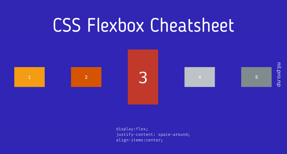
display: flex;This defines a flex container and enables the flex context for all its direct children.

By default, flex’s main axis is horizontal and starts from left to right, and the cross-axis is vertical and starts from top to bottom.
CSS Flex rule that can be applied to Container
display: flex | inline-flex;
flex-direction: row | row-reverse | column | column-reverse; [default row]
flex-wrap: nowrap | wrap | wrap-reverse; [default nowrap]
flex-flow: <flex-direction> || <flex-wrap>; [default row nowrap]
justify-content: flex-start | flex-end | center | space-between | space-around | space-evenly; [default flex-start]
align-items: stretch | flex-start | flex-end | center | baseline; [default stretch]
align-content: flex-start | flex-end | center | space-between | space-around | space-evenly | stretch; [default stretch]
CSS Flex rule that can be applied to items/children within a container
order: <integer>; [ default  0 ]
flex-grow: <number>; [ default 0 ]
flex-basis: <length>; [ default auto ]
flex-shrink: <number>; [ default 1 ]
flex: none | [ <'flex-grow'> <'flex-shrink'>? || <'flex-basis'> ];
align-self: auto | flex-start | flex-end | center | baseline | stretch; [ default auto ]
Also, Read: Top 10 Best WordPress Theme 2022 [Free & Paid]
More Details
Flex Container Property/rules
flex-direction: row | row-reverse | column | column-reverse; [default row]
- When flex-direction is defined other than a row, its main axis and cross axis position and direction will be changed.
- All other properties are applied based on the main and cross axis. If we change the flex-direction then other properties’ direction and position will change respectively due to change in axis.
- For example: If we change the flex-direction to column, then the main axis will be top to bottom, and the cross-axis will be left to right. So, justify-content will position the items in a vertical line instead of the default horizontal line.
flex-wrap: nowrap | wrap | wrap-reverse; [default nowrap]
This defines what-to-do when item’s width is greater than the container.
flex-flow: <flex-direction> || <flex-wrap>; [default row nowrap]
Shorthand for flex-direction and flex-wrap property.
justify-content: flex-start | flex-end | center | space-between | space-around | space-evenly; [default flex-start]
Positioning items on the main axis. This defines the alignment of items along the main axis.align-items: stretch | flex-start | flex-end | center | baseline | first baseline | last baseline; [default stretch]
Positioning items in cross-axis.align-content: flex-start | flex-end | center | space-between | space-around | space-evenly | stretch; [default stretch]
This defines the space/position of the line instead of items. [use align-items for items]. Similar to justify-content, but for cross axis. It has no effect when the flexbox has only a single line. There must be multiple lines of items for this property to have any effect.
Flex items Property/rules
All children items inherit the flex property from its parent(container) by default, so all children (item) will have the same flex property. However, we can override this flex behavior for an individual item using below the property/rules.
order: 4; [ default 0 ]
This property changes the order of individual flex item in its axis, Item with the lower value will be at first and the higher value will be at the last position.
flex-grow: 2; [ default 0 ]
This property defines the ability to grow flex items to cover the remaining space in the container. If all items have flex-grow set to 1, the remaining space in the container will be distributed equally. If any item has different flex-grow property, then the remaining space will be distributed in the same proportion as defined in flex-grow.
flex-shrink: 3; [ default 1 ]
This defines the ability to shrink flex items when the container is smaller than the items sizes. Similar to flex-grow for shrinking.
flex-basis: 5rem; [ default auto]
This defines the size of the flex item before the remaining space is distributed.
flex: none | [ <'flex-grow'> <'flex-shrink'>? || <'flex-basis'> ];
Shorthand for flex-grow, flex-shrink, flex-basis. Second and third values are optional. When only the first value is defined flex-shrink, and flex-basis is set to 1 0.
For example: flex:2 is equivalent to flex: 2 1 0. And, Setting flex:1 in all items will cover all space equally in the container.
align-self: auto | flex-start | flex-end | center | baseline | stretch;[ default auto ]
To position individual items in cross-axis. Note : float, clear and vertical-align have no effect on a flex item.
More Free Flexbox Resources
- FlexBox Guide: https://css-tricks.com/snippets/css/a-guide-to-flexbox/
- Flexbox Interactive Courses: https://scrimba.com/learn/flexbox
- Flexbox Guide with animated diagrams: https://www.freecodecamp.org/news/flexbox-the-ultimate-css-flex-cheatsheet/
- Flexbox playground to easily understand visually: https://codepen.io/enxaneta/full/adLPwv/
- Flexbox visual cheat sheet: https://flexbox.malven.co/
- Code sample for Flexbox: https://www.flexboxpatterns.com
- Flexbox code generator : https://the-echoplex.net/flexyboxes
- Games to learn Flexbox: https://flexboxfroggy.com/, flexboxdefense.com
If you have any confusion following this tutorial or any topics on this Nil blog, don’t hesitate to ask in the comment section. You can also reach me on Twitter.
